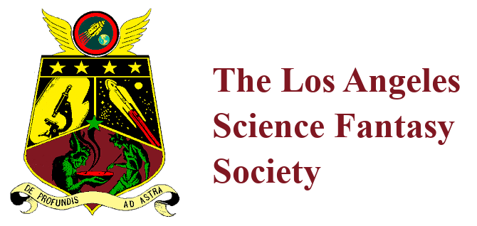
LASFS Coat of Arms
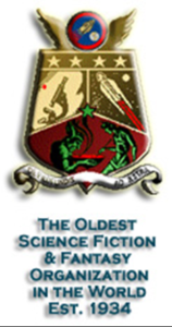
Logo by Fred Patten, based on information from Forrest J Ackerman, Rick Sneary, and Bruce Pelz — and from Forry’s collection of LASFS fanzines and general s-f newsletters from 1940 and 1941 that I read in 1976 while researching the Worldcon’s history. I hope I have remembered everything correctly. Any corrections will be appreciated, and further details should be found in the fanzines of 1940 and 1941 and added to this.
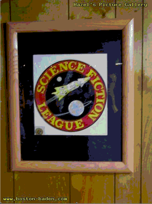
While the LASFL was a Chapter of the Science Fiction League , the SFL’s emblem was the club’s emblem. This was shown clearly in full color on the covers of Wonder Stories of May and December, 1934 and on the SFL’s enameled membership pin. (Forry Ackerman was still wearing this regularly through the 1980s and 1990s. I assume that many more LASFen had the pin in 1940.)
When the club seceded from the SFL and declared itself the independent Los Angeles Science Fantasy Society at its meeting of March 27, 1940, it sent prior notices to all the fannish newszines and major fanzines of the day, like Fantasy Fiction Field and Fantasy Times, describing in detail such trivia as why the club chose the name Science Fantasy Society instead of Science Fiction Society, etc. At or shortly after this time, the LASFS announced a fandom-wide contest to design a new emblem for the reorganized club. Obviously the club’s motto “De Profundis Ad Astra” already existed since it was required to be included. Only one entry was received, from Roy V. Hunt of Denver’s Colorado Fantasy Society, in 1940 or 1941. But it was so complete that the LASFS approved it without any change.
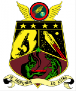
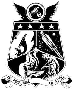
Looking at the LASFS coat of arms from the top down:
- The 1934 badge of the Science Fiction League is shown in the crest, small but in full detail except for the name “Science Fiction League,” which was removed from the rim of the circle.
- The four stars in the chief are for the LASFS’s origin as Chapter 4 of the Science Fiction League.
- The field is divided into thirds.
- The first two thirds are charged with a microscope and a spaceship in deep space, which symbolize the club’s motto De Profundis (from the depths, microscopically small) Ad Astra (to the stars, macroscopically large). They also represent “science fiction.”
- The demons stirring a bowl in the lower third are from the logo of the Weird Tales Club, designed by Hannes Bok. Although the SFL was falling apart in 1940, there were other national and international s-f clubs that the LASFS was and wanted to remain a member of. Including the WTC logo as a charge in the LASFS coat of arms signifies the LASFS’ willingness to work with or join other s-f organizations. (The LASFS bought a membership in the Worldcon for years, back when memberships were only one or two dollars.) It also represents the club’s interest in fantasy.
- The single star at the center of the coat of arms stood for the LASFS’ membership in the Science Fictioneers, a club started by Frederik Pohl’s Super Science Stories to replace the moribund SFL. (I think the LASFS was Chapter 1 of the Science Fictioneers.) The Science Fictioneers did not have an emblem of its own and may not have lasted past 1940, although the magazine did.
- At the base of the coat of arms is the LASFS’s motto, “De Profundis Ad Astra.”
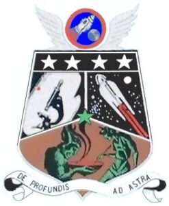
A colorized LASFS coat of arms (based on Tim Merrigan’s colorization).
Colorizing the LASFS Coat of Arms
by Fred Patten (reprinted from APA-L #2254)
When I had the LASFS coat of arms made into paperweights umpteen years ago, I was authorized to figure out what colors it should be instead of just black & white…. My colors were approved. Tim Merrigan and others made their own variations without bothering to follow the approved colors exactly.
The crest is in the Science Fiction League colors, which can be checked on Wonder Stories.
The Weird Tales Club log is in green and brown.
Everything else is in black and gold.
The spaceship’s flames in red may be prettier, but it is not what the club approved.
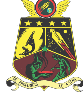
In the early mid- 2000’s, Michael Bloom took a copy of the coat of arms version then in use on lasfs.org, made a number of modifications in Photoshop to make it look cleaner for use on a T-shirt, and created T-shirts for himself and several other club members. In April of 2006, Arlene Satin saw him wearing one, and asked him where he got the T-shirt. When he told her he’d made it, she asked if she could have a copy of the artwork, and this version has become the official version used by the LASFS marketing committee.
The Marketing Committee’s Version
In the early mid- 2000’s, Michael Bloom took a copy of the coat of arms version then in use on lasfs.org, made a number of modifications in Photoshop to make it look cleaner for use on a T-shirt, and created T shirts for himself and several other club members. In April of 2006, Arlene Satin saw him wearing one, and asked him where he got the T-shirt. When he told her he’d made it, she asked if she could have a copy of the artwork, and this version has become the official version used by the LASFS marketing committee.
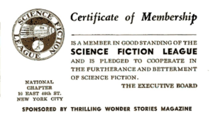
A Science Fiction League membership card.
The Science Fiction League’s coat of arms
Hazel’s Picture Gallery © 2001 Chaz Baden
